Testing
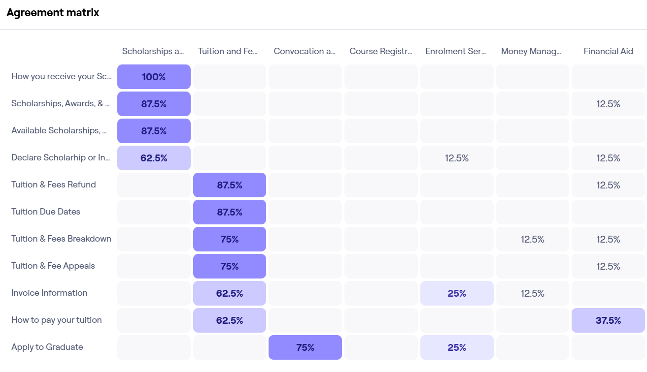
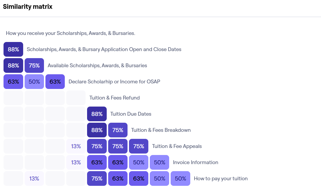
I conducted A/B testing with 8 participants, comparing the original Laurier Enrolment Services site with our redesigned prototype.
Our testing showed that renaming "Money Management" to Financial Wellness, and combining “Tuition & Fees” with “Financial Aid” improved clarity. Participants found key information faster, and with fewer steps.
The removal of unnecessary information also reduced the amount of time users took to find the information they needed.
However, our biggest changes did not reveal the information we hoped. Users did not often look at the side menu until prompted, though once discovered, it did help users navigate more confidently. Similarly, our “Skip to Subsection” bar was underutilized, likely because the section headings from the original website were unclear and confusing.
Overall, our testing revealed the biggest usability issues stemmed from vague labels, poor content hierarchy, and overwhelming page layouts.
.png)

.svg)

.svg)


